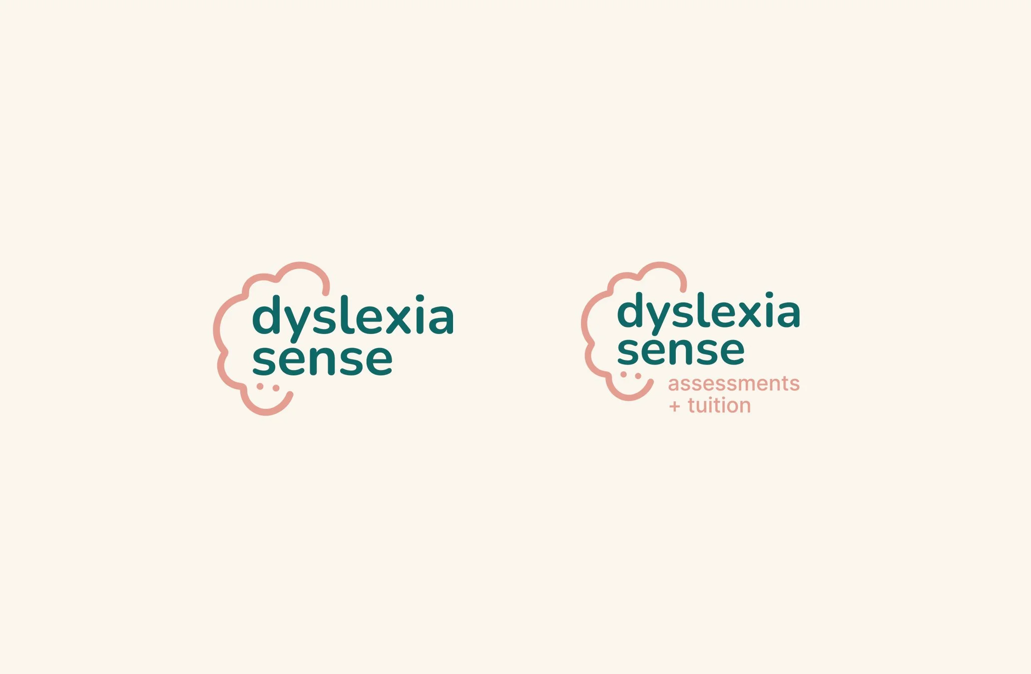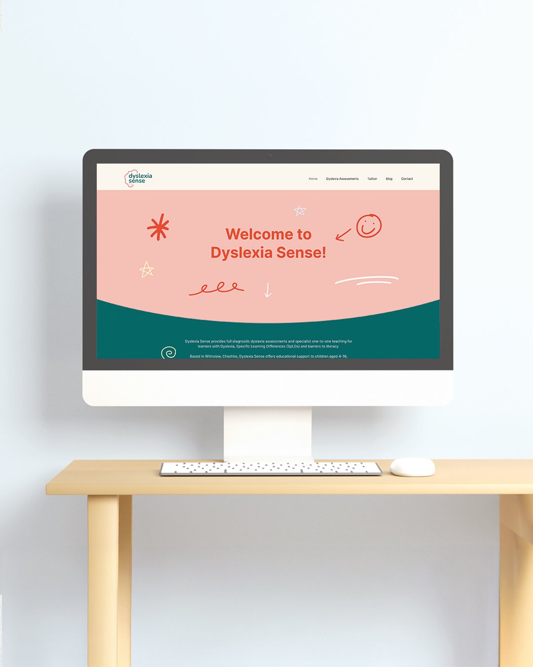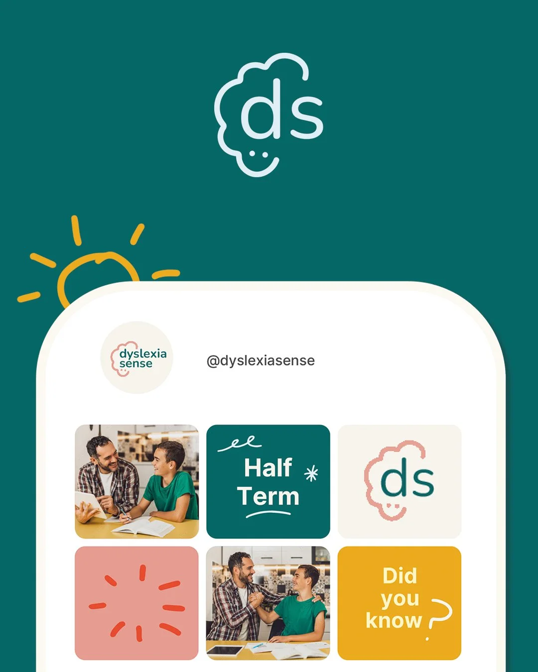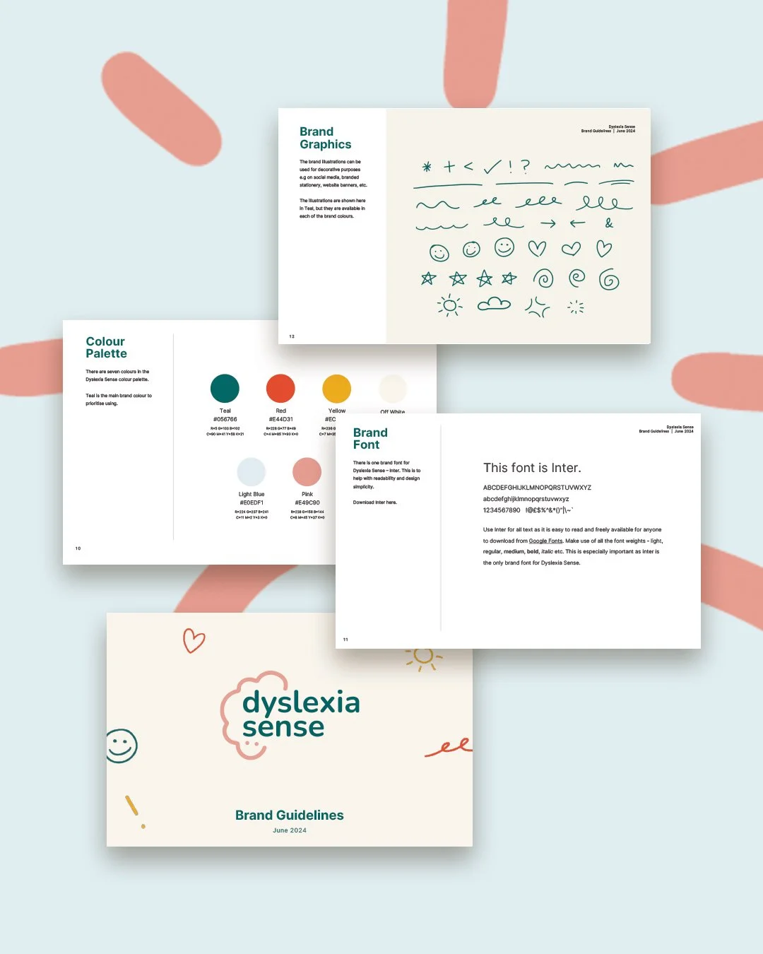
Rachel is a Dyslexia assessor and tutor who needed a brand identity and website design creating from scratch. The brand needed to look trustworthy and approachable, without appearing corporate or cold. Before design work began, I explored Dyslexia-friendly fonts, colours and ways of processing visual information – this formed the base of the final brand. The concept used no harsh colour contrasts, no bright white paper or pure black text, and easy to read lower-case fonts. The result is this inclusive, Dyslexia-friendly brand identity and a full diary of tutoring for Rachel.
It’s important to note that despite the brand actually needing to appeal to the parents of Dyslexic children, it was still important to show that the brand (and therefore Rachel's tutoring!) is accessible and Dyslexia-friendly.